MENU
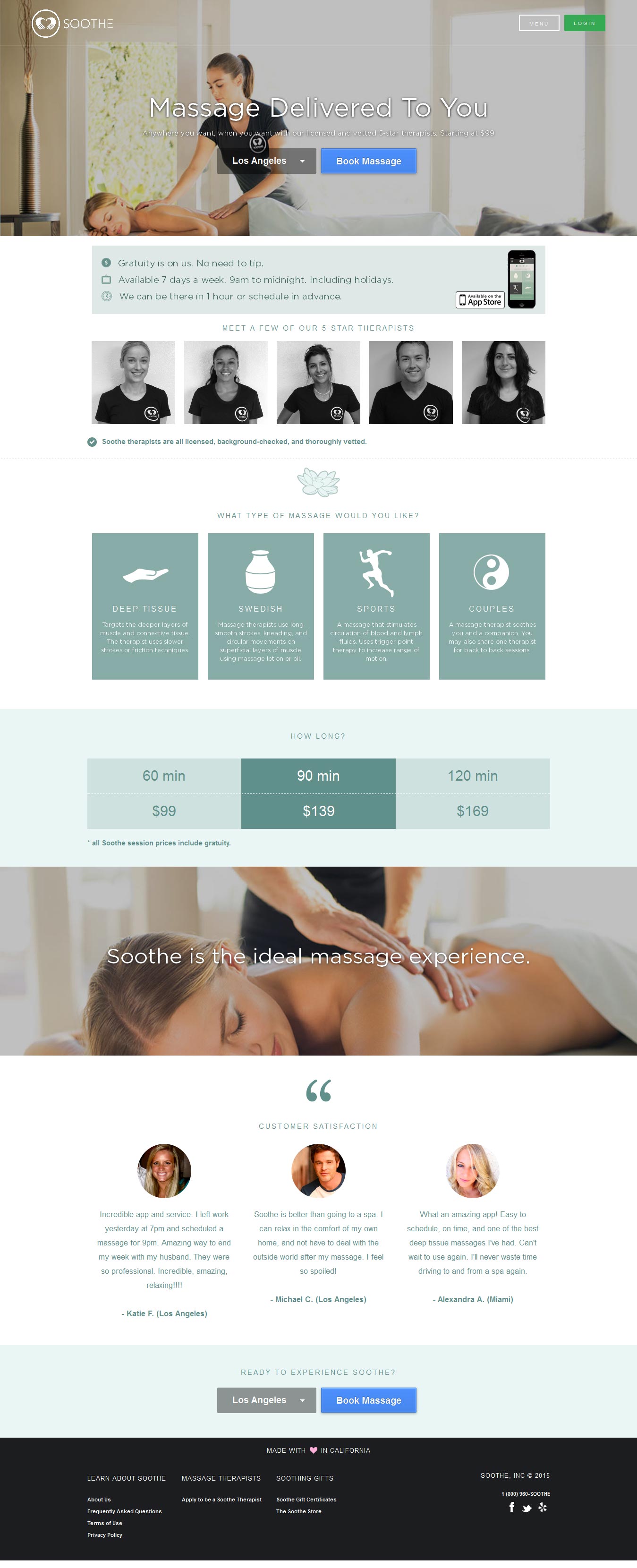
It was important that the website portrayed a consistently luxurious feel. We decided on a predominantly light and homy look, mixed with a generous use of negative space and a blue call to action colour to bring users’ attention to the most important elements of the site.
